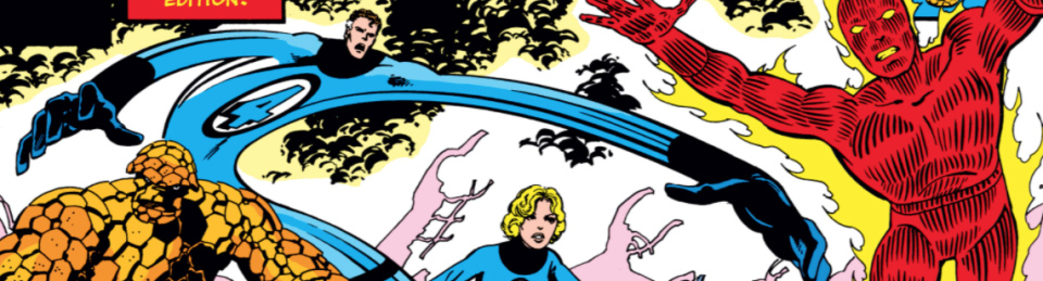
Fantastic Four 160
“In One World and Out the Other!”
Published April 1975
Writer: Roy Thomas
Pencils: John Buscema
Inks: Chic Stone
Letters: Raymond Holloway
Colors: Janice Cohen
Editor: Thomas
Cover: Gil Kane and Al Milgrom
Synopsis
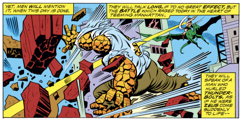
The issue opens with Arkon, a barbarian warrior from another dimension, and the Thing battling in midtown Manhattan, but Alicia Masters discovers that this Thing is not the man she knows. Back at the Baxter Building, the Ben Grimm of this Earth summons Lockjaw to teleport him to the dimension where the other Thing originated. There, after battling robot monsters and encountering a human version of himself, he discovers he is on the alternate Earth he visited in FF 118, one where Reed Richards became the Thing. Meanwhile, on our Earth, Mr. Fantastic announces plans to sell the Fantastic Four’s holding company over the objections of his teammates, a move that is somehow connected to the alternate Earth.
What’s going on here?
This issue is jam packed, and there’s a lot to discuss. The bottom line, however, is that it’s a really good comic — fun, interesting and suspenseful, the way Fantastic Four comics should be. It’s also irrefutably a Roy Thomas creation, and bears lots of his signatures: an intricate plot, dimension hopping, call-backs to older comics and his insufferable narration. For me, the ultimate validation of this comic is that I was eager to read the next one.
The length of my synopsis above signals the story’s complexity. While a Gerry Conway plot could be summarized in a sentence or two, Thomas’s takes four. The story begin abruptly, and confusingly, with the Thing (so far as we know) battling Arkon, an Avengers villain created by Thomas, and another indication of how Thomas is drawing the FF closer to the rest of the Marvel universe. In another call-back, he then takes Ben to an alternate universe created during Archie Goodwin’s brief run running the comic in one of the most imaginative (and shortest) FF stories, one in which only Ben and Reed took the ill-fated rocket trip, and where Reed becomes the Thing.
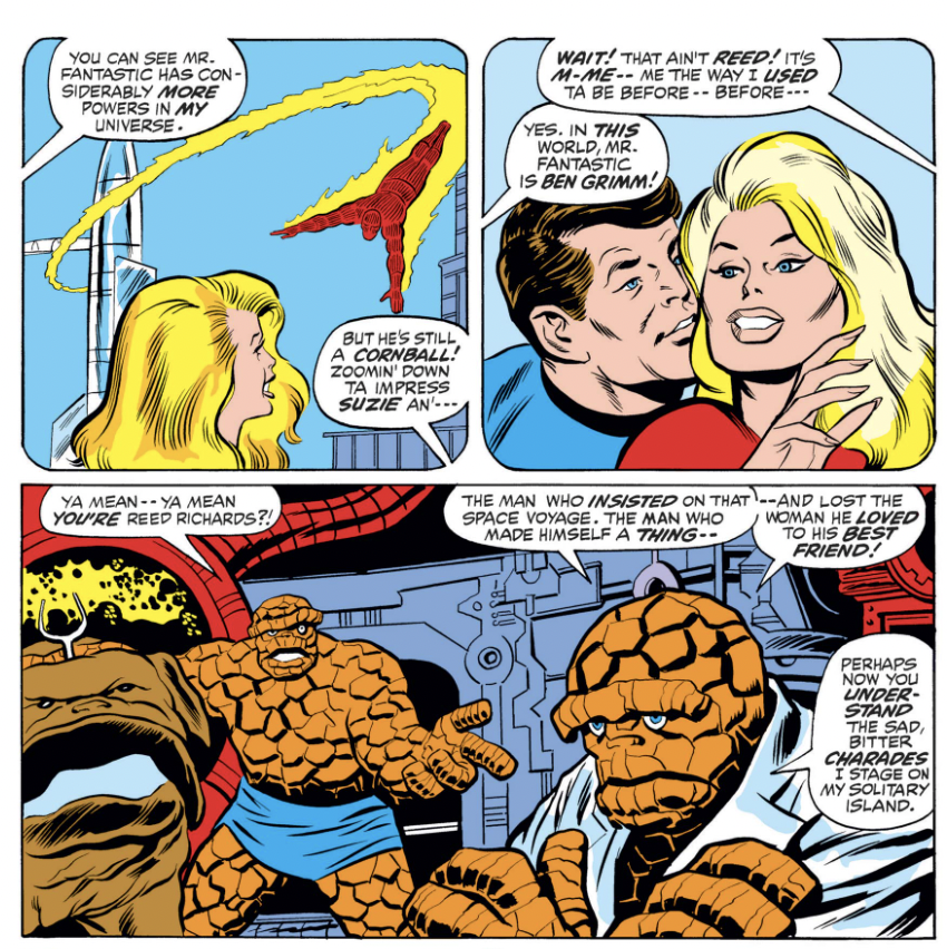
All of it is complicated by Reed’s surprising decision to sell the FF’s holding company. The move takes the comic into the world of business and finance, a category of subplot which rarely works out but here seems to hold together. Also, Reed giving himself controlling interest seems on brand for his depictions from this era.
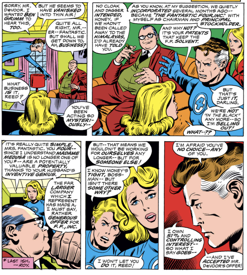
Also of note is the return of John Buscema, here inked by Chic Stone, as artist. It’s only a one-issue fill in, and since Buscema’s work here looks rushed, I’m guessing it was a last-minute thing. Another new credit: Raymond Holloway as letterer, his first and last time lettering the FF, although he worked at Marvel for two decades. As far as I am aware, Holloway is the first Black creator to have a Fantastic Four credit, and you can read a bit more about him here.
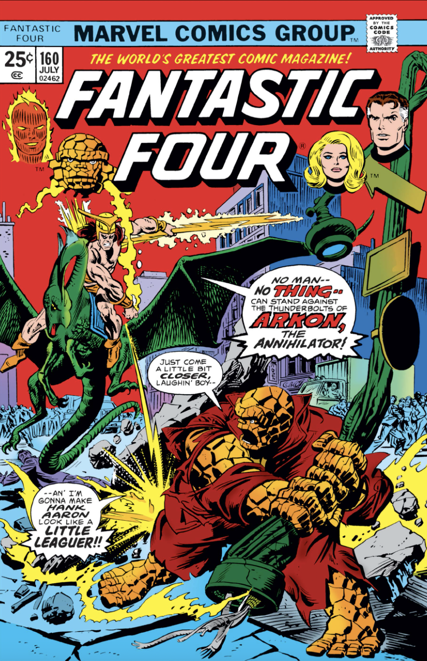
Lastly, the cover is by Gil Kane and Al Milgrom. The Hank Aaron reference is an interesting one; by the spring of 1975 Aaron had passed Babe Ruth as baseball’s all-time hime run hitter, and was a big enough star that he could be mentioned on the cover of comic book. While some racist fans mourned the dethroning of the Babe, Ben Grimm clearly wasn’t one of them (and it’s maybe worth noting the Thing on this cover is definitely Ben, not Reed, a bit of misdirection).
What I liked
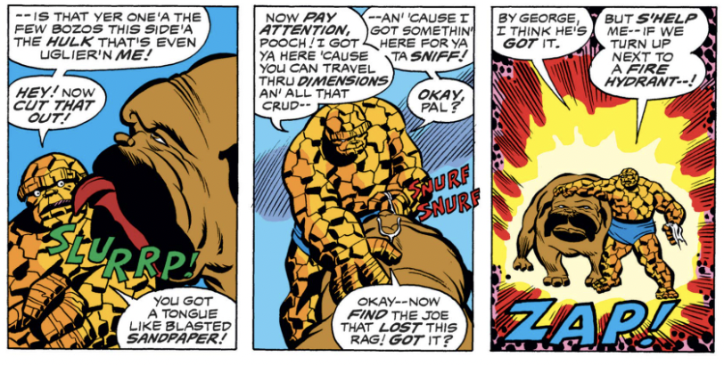
Thomas has a lot of fun writing Ben, and he imbues him with an intelligence that some other writers ignore in favor of his wise cracking or woe-is-me pathos. This is the version of Ben that is on display in Marvel Two-in-One, the comic he starred in with a guest for 100 issues.
Here, Ben goofs around with Lockjaw:
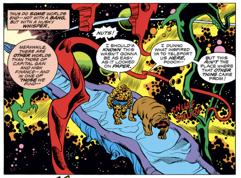
For some reason, Lockjaw first teleports them to a Ditko-esque dimension, which looks cool but has little to do the story:
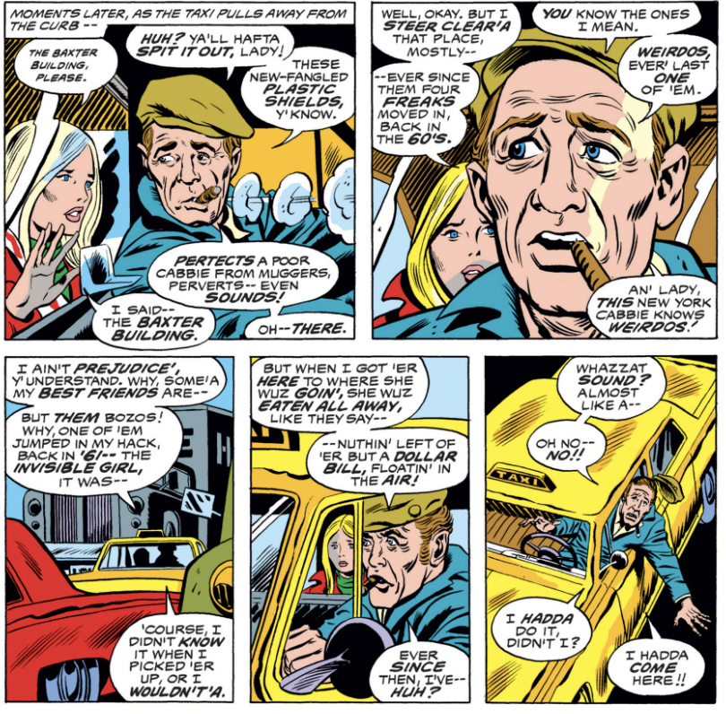
Another fun Thomasian flourish was Alicia’s interaction with a cabbie who is spooked to go near the Baxter Building:
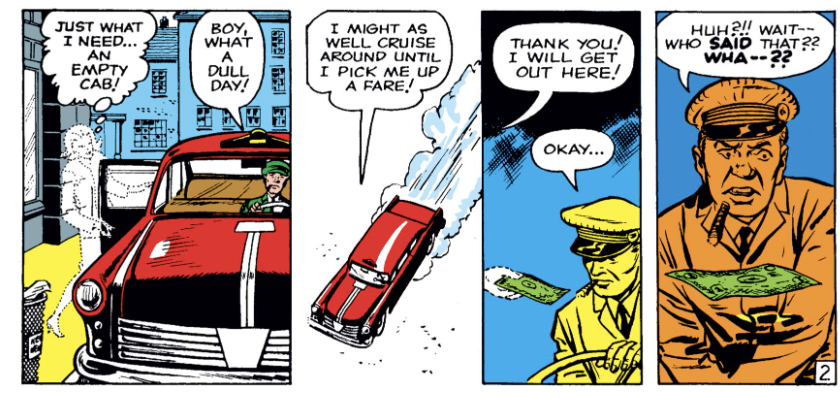
The cabbie, of course, is referring to this sequence all the way back in Fantastic Four 1, and the introduction of the Invisible Girl (he dressed a little better in 1961):
What I didn’t like
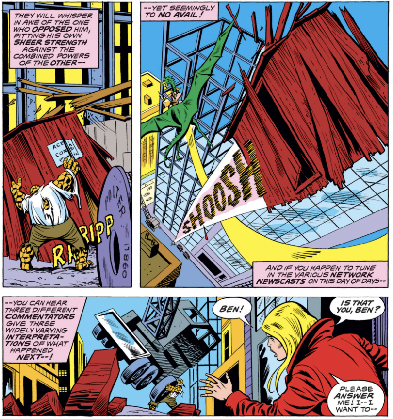
As always, Thomas is in love with the sound of his own voice (figuratively speaking) and his self-referential narration can get very annoying. Here, for whatever reason, he seems to be making some commentary about the evening TV news:
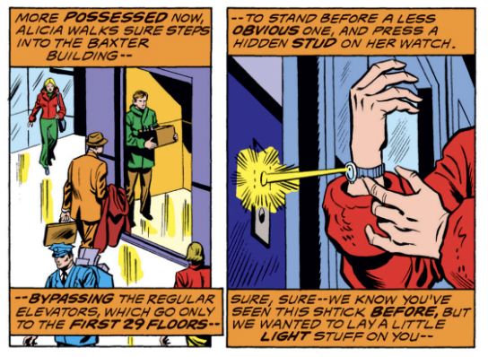
And here, more unnecessary patter:
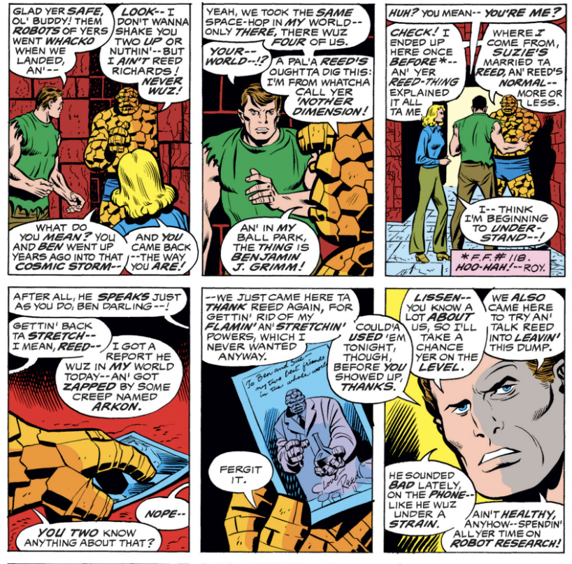
Thomas’s intricate, science fiction plots require a lot of explanation, which often means lots of expository dialogue. In some cases, it just about crowds out the art, as in these panels:
Anything else?
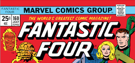
In perhaps another sign that Thomas wanted a break from the Conway era, this issue debuts a new Fantastic Four cover logo, just the third in the book’s history.
The first, of course, is the classic 60s logo, designed by Sal Brodsky:
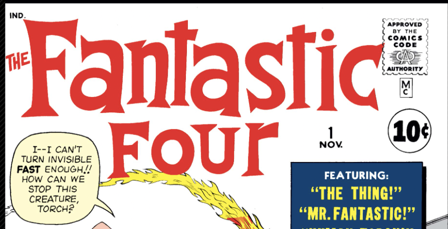
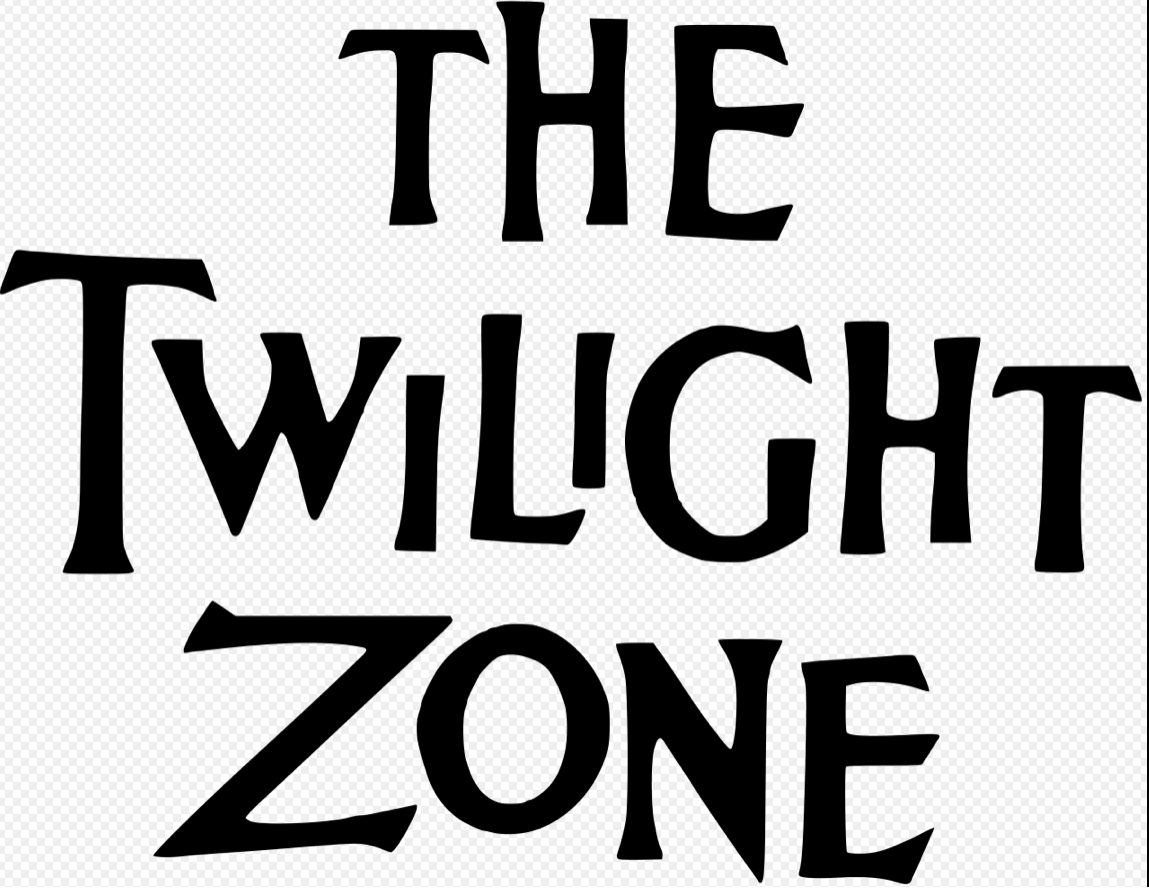
According to longtime comic scholar Mark Evanier, via Todd Klein’s blog, it was inspired by the 1959 Twilight Zone TV show logo and which captured the spirit Stan Lee wanted in the comic.
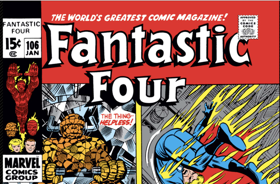
That FF logo was modified slightly, in part to accommodate the iconic Marvel corner box, which first appeared on the cover of FF 14. By the early 70s, it’s blockier and with shadow, and the letters don’t have the same zany flair, but it’s still recognizably the same.
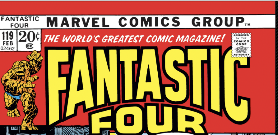
But that logo was dropped altogether in issue 119, in favor of a blockier logo that perhaps was a better fit for the new cover style which fit the art into a box (and which, for the record, I hated).
The new logo, which will last until issue 218, when it will revert back to the 60s logo, is an improvement over the previous one and has a zingy, sci-fi quality to it. It’s biggest departure, however, is dropping the corer box in far of four portraits of the FF (and maybe Marvel waited for Medusa to leave the team so it could include the original four on the logo).
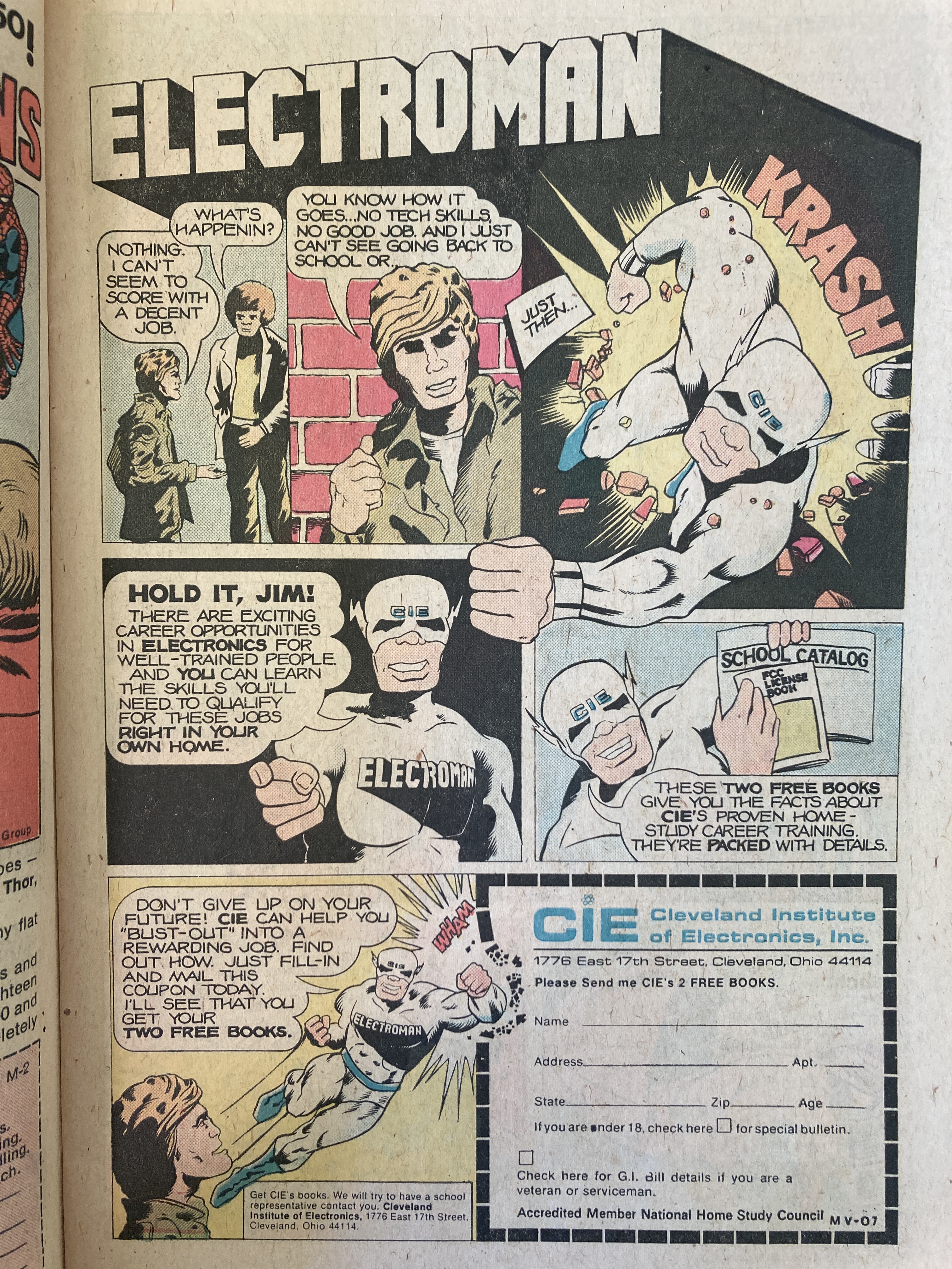
Also, some fun ads in this comic.
Electroman wants to get you a job! (I wonder if any artist will admit to drawing this)
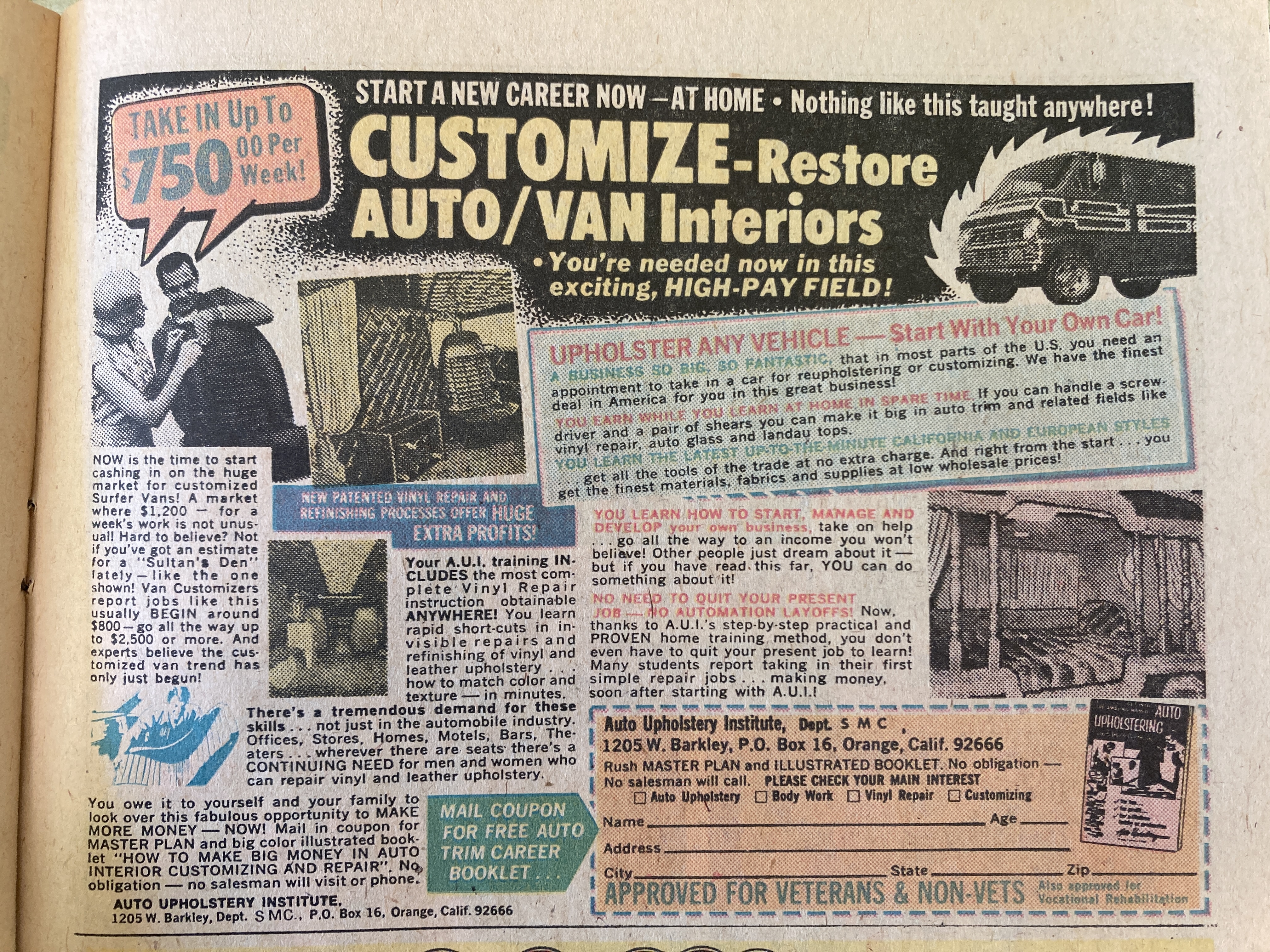
And is there anything more ’70s than custom van-interior upholstering?
Overall
Comics like they should be!

